

Choosing a great font pair is just like picking a great outfit. There’s a wide range to choose from but we have to consider the occasion because there are special outfits, for special occasions.
One of the major problems I’ve faced as a product designer is font pairing. In some cases, I’ve had to reiterate and create over 5 variations of font pairs to work with. In this article, I highlight the importance of font pairing and tips to match font pairs that work well with each other for better User Experience.
The importance of proper font pairing
Font choices set the overall look and feel of a design and selecting the right fonts can mean the difference between a compelling, attractive design, and a boring lifeless one. Here’s why:
1. To improve contrast and make the text visually interesting
The whole point of pairing fonts is for contrast. Creating contrast in fonts makes it easier for your users to read and differentiate parts of the text like heading and body. Contrasting fonts also help to catch attention more and make your designs visually interesting.
2. Convey the right message and emotion
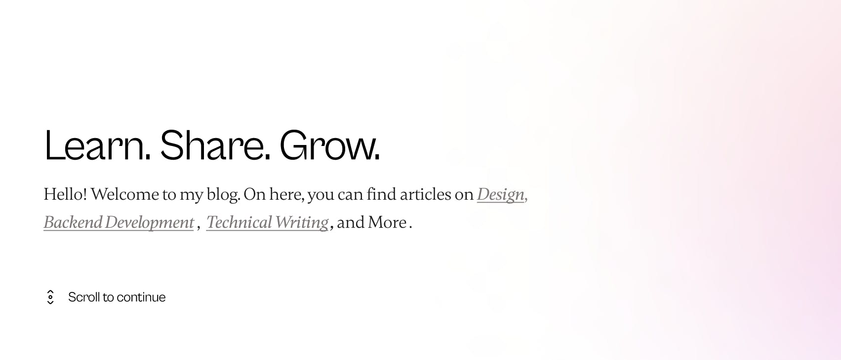
Font choices are a great influence on people’s emotions and thoughts when reading a piece of text. For example, you’re likely to read the texts in the image below, differently.
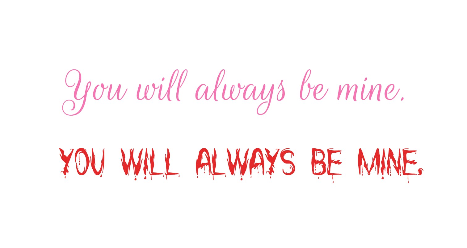
Studies have revealed that line spacing, book dimensions, and layouts play a huge role in the emotions of a person while reading. It is also noted that script fonts stimulate feelings of humor or love and serif fonts inspire a feeling of maturity. Therefore, to convey the right message in our design, considerable font pairing is vital.
3. Ensure readability and legibility
It’s also very important to make sure your users can read texts clearly and easily. Your choice of font family, style, colour, size, line-height, and weight, can all affect the legibility, readability, accessibility, and general UX of your design.
For instance, script fonts or texts styled in Italics affect user readability because the texts are slanted. Therefore, it’s a good idea to minimalize the use of slanting font styles.
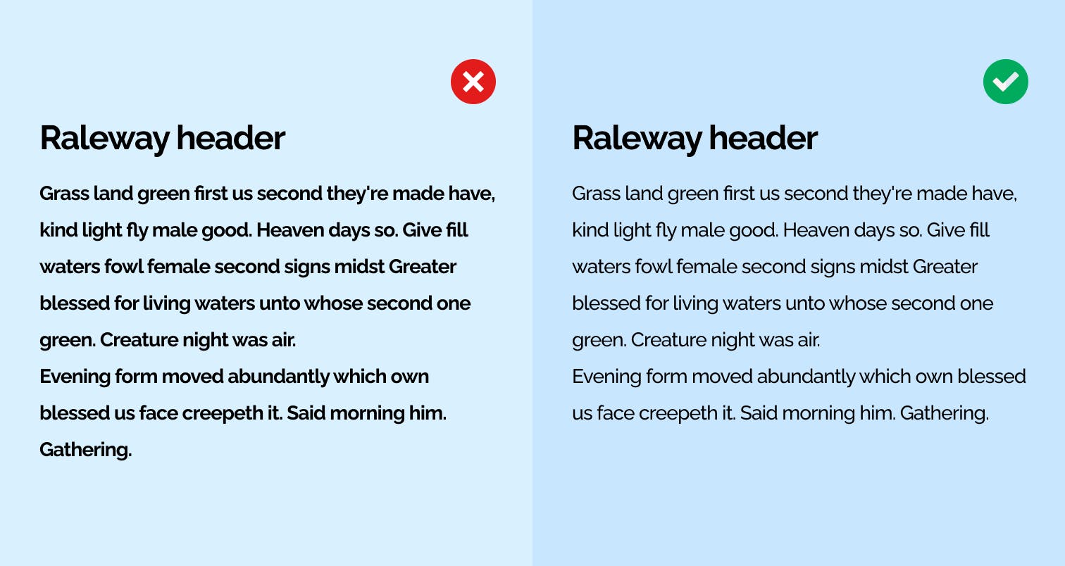
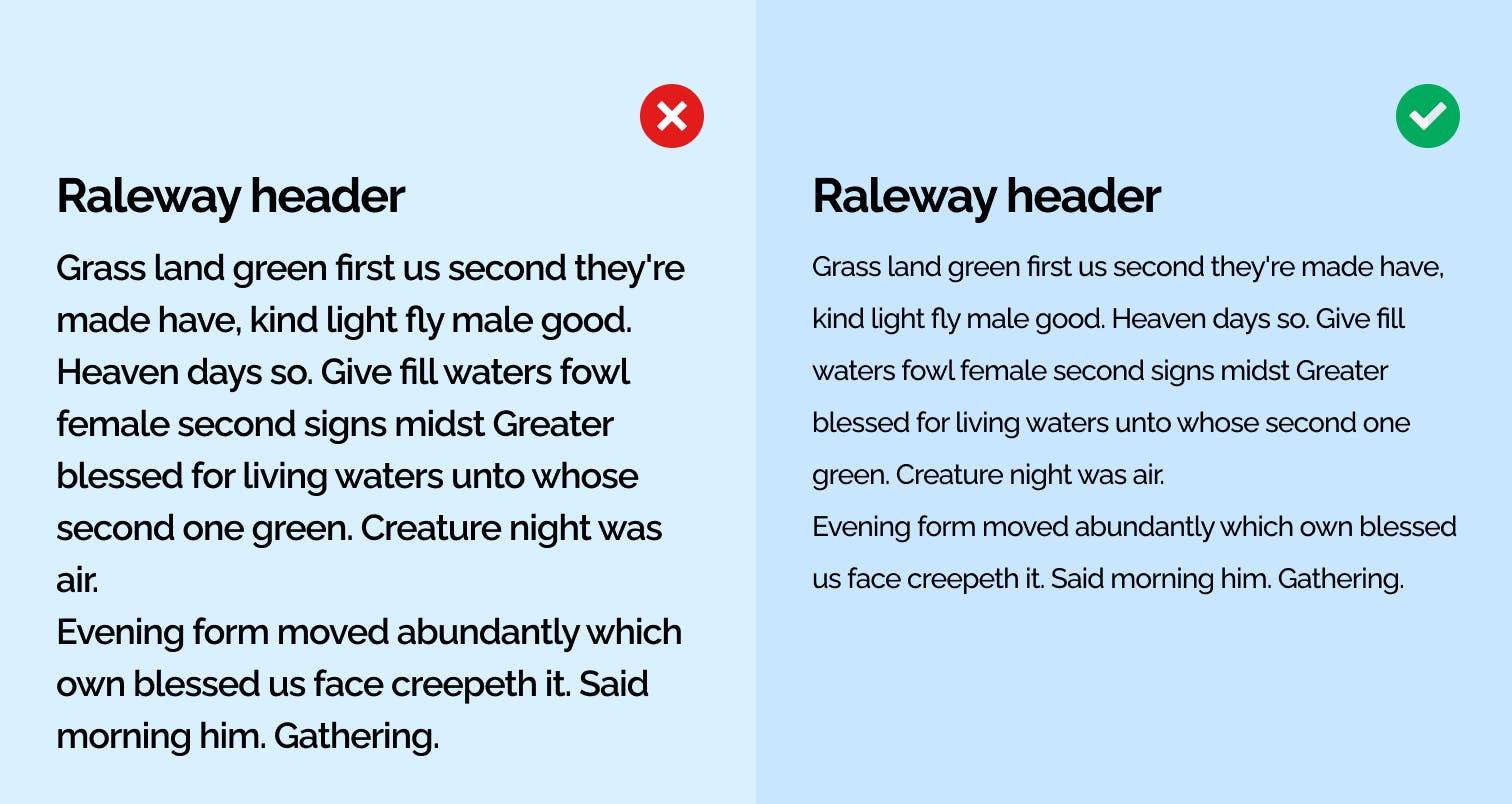
Another good example is the use of line-height. Spacing is just as important as words. To improve readability it’s important to prevent jam-packing your sentences together.
7 Best Practices for Choosing Great Font Pairs
Understanding why great font pairing is important is one thing, knowing how to put it into practice is another and sometimes, we just need a few tips to put us on. To choose better font pairs, below are a few tips to put into practice.
1. Use contrasting font weights.
Making use of varying font weights is a great way to ensure visual hierarchy and clear difference. It’s a much better combination to match a Bold Montserrat with Montserrat Regular than to match Montserrat Bold with its Semibold. It’s important to understand that matching font weights can be compared with matching people. When two hotheaded people are matched, it’s very likely for a clash to occur. In the same sense, when two heavy fonts are matched, there will be a clash.
For harmony, it’s better to practice making use of a heavy and lighter or neutral font-weight.
2. Create contrast with font sizes.
Another way to achieve contrast is by making use of varying font sizes. This helps with a better layout, visual hierarchy, and distinguishing what’s most important to the user. For instance;
3. Use only a maximum of 2/3 typefaces.
Making use of more than two or three fonts is one mistake you do not want to make. It gives room for inconsistency. Instead of overthinking it, stick to a combination of two typefaces and work with contrasts to keep it simple and consistent.
4. Pair a Serif font with Sans-Serif.
This is one of the safest, yet powerful, combos in the world of typography and design. Serif fonts are typefaces with a small line attached to the end of each stroke of a letter, while Sans-Serif fonts are those that don’t have these attachments.
Creating a font pair from these families is a great way to include contrast in your design. However, it’s important to stay away from fonts that are too different to prevent the creation of conflict instead of contrast. Examples of amazing pairs include:
- Unna(Serif) and Inter(Sans-Serif)
- Cabinet Grotesk(Sans-Serif) and Gambetta(Serif)
5. Assign roles to each font.
The importance of consistency in design cannot be overemphasized. Another way to ensure consistency in design is by using specific fonts for specific things. For example, in the image from point 4 above, Cabinet Grotesk(sans-serif) is used as a header, and Gambetta(serif) is used for body text. This gives the user a heads-up when they come across text pieces in your design.
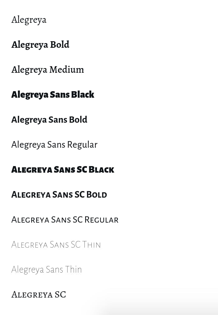
6. Use typefaces with a big font family.
Using typefaces with a large family allows the range to be sufficient. The work of pairing and hierarchy is done for you because there’s a variety of font styles you can choose from. For Instance, Alegreya.
7. Determine your brand’s emotions to avoid a mix.
As I mentioned earlier, font choices have a certain influence on the emotions of readers. To prevent a mix of emotions, you must choose a font that defines your brand’s emotion to a great extent. This improves readability and clarity for user experience.
Summing it up
Choosing font pairs is not only relatable to designers. It’s a great skill for anyone because it comes to play in many situations such as creating a resume, presentation, or even a document. Although as designers, it’s very important to know and understand how to choose font pairs because it determines the quality of work we deliver and its user experience.
I hope you enjoyed reading this article and found it useful. Feel free to drop any questions in the comments, and if you would like to show your support by sponsoring, you can buymeacoffee.